Monday, December 10, 2018

HISTORY of STYLE, DECORATION and ARCHITECTURE

CASTEL del MONTE:


PATRON: Emperor Frederick II
ARCHITECT: Unknown
LOCATION: Near Bari, PUGLIA, Italy
STYLE: Gothic
TYPE: Cultural
HISTORICAL INFLUENCE: Greco-Roman architecture, Medieval military architecture, Islamic Orient.
YEAR: 1240
MATERIALS: limestone, coralcrusched stone, marbles.
CHARACTERISTICS:
⦁Octagonal structure;
⦁Rigorously geometrical design;
⦁The eight corners of exterior marked by bastions, which are also octagonal in form;
⦁Massive walls, towers, portcollis gate;
⦁Grad entrance, framed by fluted pilasters,flanked by lions and topped by a classicizing pediment, suggest a ceremonial function, elements from classical design,influenced in Greco Roman architecture;
⦁Wall curtains, built in the local calcareous stone, marked by a string-course moulding;
⦁Eight windows with one light open on the lower floor, seven mullioned windows and only 3 mullioned windows, facing the city on the upper one;
⦁Two storeys, each with eight interconnected chambers;
⦁From the towers you can get on the roof terrace, paved with stone slabs arranged in a herringbone pattern;
⦁The division of the two floors is well highlighted by a julting frame;
⦁The towers are accepted for the presence of various loopholes, heterogeneously arranged between them, that illuminate the vain of the towers themselves and the spiral staircases;
⦁The towers enclose the facades, on each of which there are two windows, one of them not always equivalent, one on the upper floor, the other on the lower floor, with the exception of the two facades on which the main entrance portal is located;
⦁The second entrance shows no decorations, with a simple archiacuto profile;
RELEVANCE: Castel's unusual form and location - it appears like a massive crown on a hill - as well as its luxurious materials seem designed to evoke the splendor of the emperor in his dominions.

TEMPIETTO di SAN PIETRO in MONTUORIO


ARCHITECT: Donato Bramante
LOCATION: Rome, Italy
YEAR: 1504
STYLE: High Renaissance/ Classical Architecture
TYPE: Commemorative tomb
MATERIALS: Travertine marble, stone
CHARACTERISTICS
⦁Doric-order; encircling sixteen-pillar colonnade, entablature modeled, balaustrade, hemispherical dome with niches carved into its walls;
⦁Proportion of double-cylinder, two-story memorial;
⦁Emphasis on volumes, command of form, proportions, lighting, spatial arrangements and composition are evident in the sanctuary's design;
⦁The round temple is in the confined inner courtyard of the monastery, surrounded by a peristyle of Tuscan columns carrying a Romanic Doric entablature;
⦁Bearing masonry;
⦁Circular temple supports a classical entablature, framed in the shadowy arch of the cloister;
⦁Regular geometric solids;
⦁Two-cylinder arrangement is created by the structure's main circular core, called the cella,and the ring of columns that surrounds it, called the peristyle. The upper part of the cella is comprised of the drum, which supports the hemispherical dome;
⦁The sixteen columns forming the peristyle were constituted from both old and new parts;
⦁The gray granite shafts, stood out in contrast to the lighter marble forming the builing;
⦁Sixteen pilasters on the same radii as the sixteen columns articulate the cella wall on each story. This arrangement of pilasters is not directly reflected on the interior, where eight pilasters stand between large and small niches;
⦁The building use the Roman Doric order in terms of proportions and the inclusion of triglyphs and metopes in its frieze. The metopes depict papal symbols and items used in prayers;
⦁The width of the wider cylinder forming the peristyle is equal to the height of the narrower cylinder forming the cella;
⦁Marble Doric-order capitals;
⦁Apsidal niches carved with shells;
⦁Gray granite shafts from ancient Roman building;
⦁Marble Doric-order bases;
⦁Hemispherical masonry dome;
⦁Narrow cylindrical core;
⦁Doric order colonade forming porch;
⦁Pilasters cornes pending to outer columns;
RELEVANCE: The Doric order used for the Circular Capital, is the only order(with the Tuscan too) whose capitals are totally round; in being totally circular the Doric order columns parallel the form of the building itself.


FARNAM MANSION:


ARCHITECT: Unknown; Stephen Farnam: builder
CITY: Oneida/ NEW YORK
YEAR: 1862
STYLE: Italianate/ Classical architecture
INFLUENCE: Renaissance, Revival architecture
TYPE: Owned mansion
MATERIALS: Brick,wood, bronze, hand-carved panels, plaster and mouldings
CHARACTERISTICS:
⦁Low-pitched roof;
⦁Projecting eaves supported by large decorative cornice brackets;
⦁Tall windows with ornate pediments;
⦁Bay windows at north and south sides of the house;
⦁Wrap-around porch at the north and east side;
⦁Square belvedere is situated above the est side of the mansion;
⦁Mansard roof and a trio of arched windows on all four sides;
⦁Front entry of the mansion features a pair of arched doors with windows, hand-carved panels and rare ornamental bronze doorknobs which feature a highly stylized dog's face and paws;
⦁Dominance of the shouldered, pointed arch that makes this house interesting, the arch where the curve of the arch is interrupted by a vertical projection; in this case the projection is pointed; his shape combines curves and straight angles together;
⦁The porch has rectangular openings but features the shoulder arch running inside these openings with jigsaw cut-outs;
⦁Same shape unifies the triple arched windows at the top of the tower and is repeated again in the base of the tower cornice;
⦁Concave roofs on the porch, bay window, and tower along with the delicate cresting;
RELEVANCE: The mansion features a tower topped by overhanging cornices supported by ornate brackets. Similarly, the windows are decorated with very heavy hood-moulds and cornices, details which add considerable richness to the building.

FARNSWORTH HOUSE:


ARCHITECT: Cudwig Mies van de Rohe
LOCATION: Plano, Illinois, USA
STYLE: International Style
INFLUENCE: Modern movement
YEAR: 1951
MATERIALS: steel, glass, stone, marble
TYPE: Historic house museum
CHARACTERISTICS: 
⦁glass box bracketed by thin, white floor and roof slabs;
⦁vertical steel columns raise the entire structure above the ground - a flood plain - accentuating the sense of the house as a sculptural object placed within the landscape;
⦁clear floor-to-ceiling glass opens the interior to its natural surroundings to an extreme degree;
⦁two distinctly expressed horizontal slabs, which form the roof and the floor, sandwich an open space for living;
⦁the slab edges are defined by exposed steel structural members painted pure white;
⦁the house is elevated above a flood plain by the eight wide flange steel columns which are attached to the sides of the floor and ceiling slabs;
⦁the slabs ends extend beyond the column supports, creating cantilevers;
⦁a third floating slab, an attached terrace, acts as a transition between the living area and the ground;
⦁the house is accessed by two sets of wide steps connecting ground to terrace and then to porch;
⦁free and open space within a minimal framework, using expressed structural columns;
⦁the house is anchored to the site in the cooling shadow of a large and majestic black maple tree;
⦁the entrance is located on the sunny side, facing the river;
⦁the simple elongated cubic form is parallel to the flow of the river, and the terrace platform is slipped downstream in relation to the elevated porch and living platform;
⦁the synthetic element always remains clearly distinct from the natural by its geometric forms that are highlighted by the choice of white as their primary color;
⦁raised travertine marble terrace;
⦁three strong, horizontal steel forms - the terrace, the floor of the house, and the roof - attached to attenuated, steel flage columns;
RELEVANCE: The house stand as a monument to purity and obstinacy, an unattainable yet fascinating state of domestic perfection. The notion of a space enclosed in a glass and supported by a minimum of structural framing located at the exterior, is the architectural ideal of space concept of Mies.

BARCELONA PAVILION:


ARCHITECT: Ludwig Mies van de Rohe
LOCATION: Barcelona, Spain
STYLE: Modernist
YEAR: 1929
MATERIALS: steel, rein forced concrete, travertine, onyx, marble
CHARACTERISTICS:
⦁flat concrete roof slab supported on a regular grid of cross-shaped steel columns that allow the roof to as effortlessly floating above the volume while freeing up the interior to allow for an open plan;
⦁structural supports concealed in some of the partitions to assist the main columns;
⦁travertine base and onyx and marble partitions treated with absolute simplicity;
⦁columns were chrome;
⦁entire building rests on a plinth of travertine;
⦁u-shape enclosure, of travertine, helps form a service annex and a large water basin;
⦁the floor slabs of the pavilion project out and over the pool connecting inside and out;
⦁another u-shape wall on the opposite side of the site also forms a smaller water basin;
⦁plates of high-grade materials like marble, onyx as well as tinted glass of grey, green, white , as well as translucent glass, perform exclusively as spatial dividers;
⦁the materials expressed through the rigor of their geometry, precision of pieces and the clarity of their assembly;
⦁low horizontal orientation that is accentuated by the low flat roof that appears to float over both the interior as well as the exterior;
⦁the low stature of the building narrows the visitor's line of vision forcing one to adjust to the views;
⦁walking up onto the plinth, one is forced under the low roof plane that captures the adjacent out door court as well as the interior moments that induce circulation throughout the pavilion;
⦁the interior consists of offset wall places that work with the low roof plane to encourage movement where framed views would induce movement through the narrow passage that would open into a larger volume;
⦁the low profile of the roof appears in elevation as a floating plane above the interior volume;
⦁the appearance of floating gives the volume a sense of weightlessness that fluctuates between enclosure and canopy;

ELEMENTS and PRINCIPLES of DESIGN

RUSTIC CHALET:


SPACE: This cozy living/dining room is a perfect space for a mountain view. It makes you feel secure and comfortable when you glimpse the masterpiece of the room: the fireplace. Additionally, the big windows make the space airy and bright.
LINE: Even if we clearly see different type of lines in this room, the vertical wall surrounding the fireplace gives to the piece dignity for the choice of materials. The horizontal lines of the beams running through the ceiling combined with the diagonal lines on the herringbone parquet bring movement and direction to the room.
SHAPE: The space has a geometric aspect; the height exposed ceiling creates an open bright space. The composition of the ceiling reminds of nature and, as a result, has a nature-feel to it. The rock on the fireplace wall is an important piece in contrast with the wood shelf and all the other wood finishes. 
COLOR: The colors of the shades in the room create a cold environment, which relates well with the white snow of the mountain, brought inside. The color of the wood ceiling as well as the parquet and the choice of the textile furniture create a sense of elegance. The basic color is the neutral beige scale, which is a safe color. The different color shades of the ceiling lend some confusion to the eyes, but it is immediately stopped when one sees the black steel beams.
TEXTURE: The choice of the wood table is nicely matches the plain texture of the seats and the plain texture of the couch. The wall gives me a sense of rough texture in contrast with the smooth parquet or the other surfaces. The chandeliers, each made of a different construction, one, a natural branches look and, the other one, of elegant and sophisticated stones, create a sense of confusion. The noticeable difference between the two might be creating an image of too much going on though.
LIGHT: We have two different kind of lights: a natural one coming from the large windows and then an artificial one coming from the warm fireplace, the big chandeliers, and the lamps, which can create an intimate space when getting dark. I notice how the chandeliers are positioned near the dinning table, which make sense in order to have more light in that area for dining. At the same time, if you choose to have a cozy intimate moment on the couches,  you may utilize the table lamps or just the light emanating from the fireplace.
PATTERN: The visual impact of this room is definitively centered in the fireplace, which creates a rustic style in between the wood ceiling, parquet and other wood surfaces. The chandeliers also play an important role in the space blending with the environment. The black steel beams also define a line of space, which gives a sense of grandeur and stability.
BALANCE: I can definitely see a symmetry in this area from the arrangement of the furniture, which portray a feeling of calmness, and the choice of colors, but also a sense of asymmetry thanks to the materials and the sense of lines used, which creates movement and spontaneity. The balance in this room is created by the high ceilings and the exposed beams (feeling of stability). The chandeliers also lend to the balance in the room. 
RHYTHM/REPETITION: This open space has even rows of panels and lighting. The repetition of colors is evident in most of the space, the beige/white of the panels ceiling in proportion with the parquet, the couch, chairs, lamps. I would label this rhythm a soft piano jazz with a bit of drums on the side. The repetition of materials is also evident even if in different lines, like the wood or the textile material of the chairs with the couch.
EMPHASIS: The focal point of this room is the fireplace wall which includes a different kind of material surface in contrast with the wood but nicely combined with the wood shelf, the two leaf accessories, and the central painting. 
PROPORTION and SCALE: The high ceiling with the big windows are a relevant part in the room in contrast with the human scale. The chandeliers are an integral part of the feeling for their grandeur in proportion with the other furniture. I can see a good choice of accessories/decorations while considering the chandeliers a focal point of them.
HARMONY: I can conclude my examination of this room by pointing out that all the choices nicely combine in a harmonious,  cozy, elegant, intimate, rustic, and bright space. All the materials fit very well for the environment: the wood ceiling panels with the wood parquet harmoniously combine with the textile materials of the chairs, couches and cushions, the rock wall of the fireplace, and the black steel beams. A rustic elegant chalet for a relaxing mountain vacation feeling!

DELUXE RESTAURANT/BAR:


SPACE: This restaurant is very elegant, modern and suggests a sense of intimacy from the dark colors and soft lights. The space is divided in more areas: a private one on the side of the room and the end of it, and a socializing one at the bar.
LINE: The vertical lines of the panels give to the space a strength, dignity, and a formal atmosphere. The division of the areas are visible thanks to the curtains and the contrasting materials from one space to the other. The thin lines of the panels give to the space a sense of elegance and lightness; the vertical block shelves also lead your eyes from the bottom to the top and vice-versa.
SHAPE: One can definitely see a geometric shape to this area from the block shelves to the back panel wall. The curtains are lend to the space the illusion of being higher than it actually is. Part of the structure is hidden back just to create another space, a more private, intimate one. The composition of most of the walls, concrete, employ a plain look that are in contrast with the panel wall in the back but a nice alternative, even with the curtains and the herringbone parquet creating a bit of movement. The lines of the light fixtures match the panel wall in the back.
COLOR: The choice of the colors in this room create a modern/minimalist look. The dark walls are in contrast with the parquet, a decision that I agree with as it creates a better visual separation of each element. The dark colors creates an intimate space; the right feeling for a private dinner but the option of the big lights give the chance of creating a different feeling during lunch time or other parts of the day. One can also see spots of green which give to the environment a touch of nature in contrast with the cold element of the concrete. The different shades of the parquet create movement in proportion with the plain walls and curtains.
TEXTURE: The feeling of the space is sophisticated and formal as a result of the the ambient restaurant. but  it also has an urban modern look to it. The choice of the panels, wood accessories, parquet, and the texture of the couches and chairs gives us a sense of nature mixed with a cozy space in a relaxing area.
LIGHT: We do have the long windows on the side for the natural daylight, which make the space comfortable for breakfast/brunch/lunch or for a simple business meeting. On the other side, we have artificial lights on the panels which create an intensity or intimacy for the space. Though they are not very bright, they have a sophisticated feel to them and are not invasive to the eyes. This kind of light creates highlights and shadows, the right touch for a formal place such as this one.
PATTERN: The panel wall is definitely the first pattern that one's eyes are attracted to when looking at this picture in addition to the big lights. The choice of both sides of the block shelves with the similar furnishing and accessories create a sense of balance. The division of the space is made well by the regular curtains from the ceiling to the bottom of the floor and also the division from one window to the other.
BALANCE: I can see a balance on both sides of the room with the box shelves, but also an informal balance caused by the difference of the accessories used in the shelves, a casual, relaxed feeling creating movement and spontaneity. We also have the giant lights in a relatively small area with a tall ceiling, high shelves, and, from top to bottom, the curtains which create that balance and equilibrium for the space.
RHYTHM and REPETITION: We have the repetition of the lights which are placed in a sequential line, creating a visual link with which the eye can follow and allowing the eye to move from one part of the design to the other. There is also a rhythm to the windows alternating with the curtains and a pattern to the table and chairs which brings the movement of the eyes again from one side of the room to the other. The repetition of the panel walls form a background embellished with the big central lights. Since pattern and repetition are related we have the herringbone parquet flooring which adds pattern to the space.
EMPHASIS: I would say the the focal point of the area is the big repetition of lights, which are big, draw attention, and in rows around the room. This easily draws the attention of the eyes and has one looking around the room.
PROPORTION and SCALE: We have again the big lights, which pop when one looks at them relative to the other small accessories or furniture. They create a balance with the tall windows/ceiling/curtains. The perception of the lights give us a sense of big suspended objects on the top of our heads.
HARMONY: In the end, the harmony of this room was helped by the dark colors to the big lights, the touch of green, and an insert of wood pieces creating an urban modern look with a touch of sleek and nature inspired feelings. All the elements nicely work together, creating a relationship with the space and structure.

GREEN BAD:


SPACE: A simple, square bedroom with a dark wall that gives a sense of cold space but nicely combined with the parquet and flowers which, make the room warmer. The look of the room is modern, sophisticated, and industrial.
LINE: Vertical lines are used for the headboard as well as for the flooring. The vertical lines suggest a feeling of dignity in this case, making the bed the centerpiece of the room.
SHAPE: The shape of the fixtures and the curtains hanging high at the top of the wall create the illusion of larger windows, even though the windows are big as is. The window sills are not deep which helps in creating the sense of a more cozy, romantic room. The materials of the walls have an industrial look to them. The nice horizontal parquet bring the eye to the window creating a visual point to it. The shape of the headboard matches the vertical suspended lights.
COLOR: I really like the combination of the room colors; the simple neutral walls match the shades of the parquet in contrast with the choice of the green emerald bed and soft pink accessories, which also match the green flowers on the window. The long suspended lights with the small one on the headboard create an intimate atmosphere, the soft touch for a dark night!
TEXTURE: The polished plaster of the wall give a look akin to a polished marble finish, creating a smooth surface with the illusion of depth and texture. The texture of the furniture give the place a nice touch of modern romantic sophistication, and the thickness give to the piece an important attention. The carpet has almost a faux-furry look to it and the horizontal parquet a restful, informal casual look.
LIGHT: The big window brings a lot of natural light during the early morning, which can be altered with the curtain, making the light more intense by moving them to the end of the room or less intense by moving them to the center of the window. The artificial lights can be controlled to create the illusion of a morning light using the four smaller lights in the room. At the same time, a soft and warm ambiance can be created using the small light on the headboard say for when you want to read a book, for example.
PATTERN: The modern textile, velvet, ruffled bed creates a pattern thanks to the repetition of the vertical impressions on it; the headboard accentuates its height and gives a classy elegant feeling. The shadows on the wall create a kind of pattern with an illusion of depth and texture.
BALANCE: All the elements are balanced on an asymmetrical way to create the right equality. The big window balanced with the big bed. There is also an informal balance caused, on one side, by the suspended lights and, on the other side, by a different style of light and accessories. Big flowers with small flowers create a balance for the eye and give the possibility for the light to come in at different shades.
RHYTHM/REPETITION: Repetition of texture in the headboard accentuates its height, creating an imposing piece. The repetition of the suspended lights, having the same style but using different lengths, create a bit of movement. Repetition of the flooring panels gives us a sense of restful, casual feeling and leads the eye from one point to another. 
EMPHASIS: The focal point of the room is the bed, more specifically, the headboard and the color which makes a good impression to the eyes the first time one sees it. You are not going to notice the walls, the parquet, or other aspects of the room before noticing that centerpiece: the BED!
PROPORTION and SCALE: All the elements are proportional to the space: low ceiling, small lights, big windows and big furniture. One big object, the bed, balances the proportion in the room since it is one of the few pieces of furniture.
HARMONY: The harmony in this area can be seen from the big centerpiece of the bed to the minimal but useful furniture, like the chair or the mirror, the soft pink curtains matching the emerald green to the choice of beige shades to match the parquet, the wall and the blanket. The touch of the room is beautified by some greenery and a romantic white vase with cherry blossoms.


Monday, October 29, 2018

MINI FRIED CALZONES

I just love this recipe cause it make me remember the taste of Italy reason why I want to share with you...ready to start this easy recipe which doesn't need leavened!!!


INGREDIENTS:


220 ml cooking cream


1 teaspoon of salt 


300 gr flour 


mozzarella


tomatoes 


oregano 


                                                    Add the cooking cream in a bowl, the salt and start kneading adding the flour a little at a time.
                                                               We continue until we obtain a homogeneous consistency.


We gonna roll out with a rolling pin to obtain a thin sheet. With a cutter of about 10 cm we form many discs. It will be stuffed how we prefer. I can add some mozzarella on the discs and some tomato with salt and oregano; I really like the prosciutto stuffed to.


                                                 Brush the edges well with a little milk ; close well with your fingers and seal with a fork.


                                              In a pan we gonna heat the oil for frying the calzones. We gonna fry them until browned.


While they are still warm we can add some salt.


ENJOY THE FRIED CALZONES!!!!!!


Wednesday, February 21, 2018

WISCONSIN DELLS WINTER VACATION - "UP NORTH"

Many people head over to the internet for deals and inspiration for things to do after picking a destination for their vacation. I did the same when we made our Wisconsin Dells trip for 5 days. Why Wisconsin Dells and where is this place?
UP NORTH:
There's a lot of talk about "up north". It's the place everyone seems to want to go to escape the pressures and frantic pace of everyday life? But where is "up north"? For "up north" is not so much a location as it is a state of mind.
So, how do you know when you've arrived "up north"? When you feel the cares of the world begin to slip away...When you find yourself breathing a little deeper because the air seems purer somehow...When you notice that the sky is bluer, the pints are taller and the people smile a lot more...It's then you know you're " UP NORTH"!


So, after our little vacation, I want to share with everybody some things to do in the Dells.
We personally choose Wisconsin Dells since it is not too far away from Chicago, no more than 3 hours driving. My husband used to visit here regularly during his childhood; I definitely think it is a nice destination for winter.

On the way to Wisconsin


After some on-line sifting I found this very nice location: CEDAR LODGE CABIN and SETTLEMENT. Here you can find the website: https://cedarlodgedells.com/


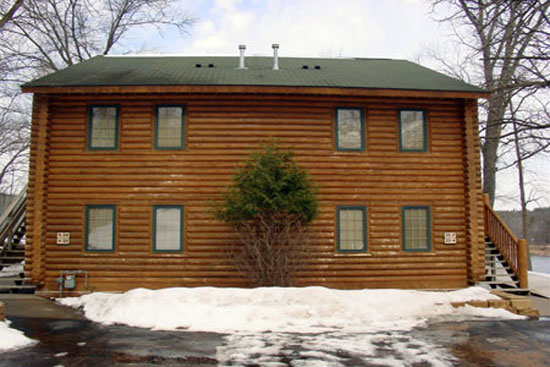
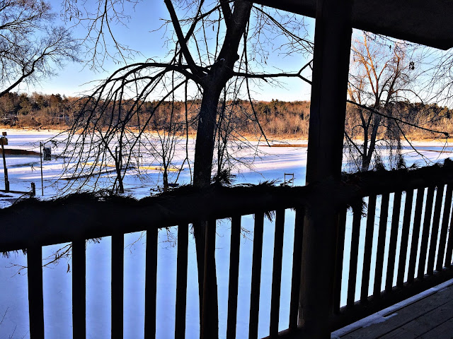
CEDAR LODGE is a resort located on the Wisconsin River next to Lake Delton on the lower Wisconsin river. You can find lodge rooms, suites and villas all with river views. During the winter, the views can be a "little" different; the river was frozen during our stay, but it still produced some spectacular views, especially during sunrise/sunset, with the sun reflecting very nicely off the ice. I can describe this place as a perfect, rustic, cozy, friendly place for a winter vacation, just what we needed.
We chose the 4 person Fireplace Suite as I just had to have a fireplace to go with the rustic look; it's just not the same without it. The suit itself is sort of an apartment within a cabin as seen below; we got suite number 25...


Here are some pictures.


Crazy ol' me in -4 degree weather 

River view mostly covered in snow


Perfect relaxing corner 


I just love the cozy winter cabin

I really recommend the Cedar Lodge Cabins. You have everything inside that you need. For example, the kitchen is fully stocked in case you wish to prepare a meal. The space itself is very spacious. Though it is described as a 4-person suite and comes with a sleeper sofa to accommodate; bringing along another couple would be fun but privacy would be sacrificed as a result. On the other hand, if the other 2 are your kids, the space would probably suffice. They also provide an everyday cleaning service room which I loved. 

After arriving that first day and getting all our luggage in place, we took some time to study some of the brochures at the office in order to decided what we were to do the next few days.
First and foremost, we had to have dinner so I found a really nice cozy place within walking distance of our place. It was called "The River Edge Bar", a rustic dining experience which was exactly 3 min walking from the cabin. Though it was crazy cold outside, we still decided to brave through the chill on foot. In the end, it was a nice quick "adventure" and it passed by so quickly, we barely thought about the cold.


Very nice fireplace and cozy atmosphere 


We had a great meal that night; I decided to go with ribs which were SO SO good and my husband had the Alfredo pasta.


We also managed to get some discounts at many of the restaurants that we visited; we found them in the brochures at the Lodge office, so we were able to save a few bucks here and there too! 

Every morning, we headed on over to Denny's for breakfast; I just loved this place.


Eggs, pancakes, sausage, bacon and hash-browns - great meal for the start of the day

Hot tea with honey for a cold day!!!


After a great breakfast, we decided to visit Cascade Mountain, a ski mountain, which is located on Interstate 90/94 between Madison,Wisconsin and Wisconsin Dells. The Mountain offers 44 trails varying beginner,intermediate, to advance. 
This time, we decided not to ski since we wanted just to relax and hang out in the chalet watching everyone else ski. In the meantime, we drank some hot coco, basked in the sun, and leisurely walked through the snow on the mountain. 


I think it is great when people share their experiences, especially when it comes to their trip experiences as it can serve as inspiration for not only future destinations but can also provide ideas for activities at said destinations.

After an afternoon in the snow, we went back to our cabin; I decided to broil some wine with cinnamon and sugar, a specialty snack for a cold day. I remember back in Romania, during the winter time, even as little kids, everybody gave us broiled wine...I think the broiling step actually removed a lot of the alcohol. I remember enjoying those moments a lot, which is probably why I remembered the taste so well. As a result, I whipped up myself a glass to enjoy in Wisconsin! 


I was very happy with our cabins as we had all that we needed in the kitchen to do some cooking; it felt just like home. Though we could have easily prepared a meal, the improvised snack hit the spot just perfectly  and was just what we needed to relax.


I also decided to take a hot bath to remedy the cold outside. After putting in some bath balls, I just laid there enjoying a nice, relaxed bath before dinner. 

For the evening, we decided to have dinner at Buffalo Phil's.


I really enjoyed this place; it was very unique since they have a toy TRAIN that delivers your food directly to your table. It is definitely a place to go if you like trying new things that also have unique aspects to it. 


The next day, I decided to treat me and my husband to a couple's massage and facial. Prior, I looked online to search for good prices knowing that prices are typically high for such services. I ended up finding a cute little spa not too far away from our cabin. The good reviews ultimately convinced me to pick it. I made an appointment, and we made our way to Sun Mountain Spa.


I chose the PAMPER ME, which consisted of a 30 min Therapeutic Massage, a 30 min foot stress relief reflexology with peppermint essential oils, a stress relieving scrub, a honey heel glaze wrap, and an amazing Relaxing Chinese Mediterranean Facial. All of it together totaled about 1 hour and 45 minutes. I had never had this kind of facial before, and, ultimately, I was very impressed and happy with it because I really enjoyed the specific zone touching massage on my face. I also do facials at work; after I start working with the company Atomy, I began using natural products. As a result, I am pretty sure I will be trying out some of these Chinese movements myself on my clients.

After the relaxing morning, we had a very delicious lunch at a restaurant called B-LUX Grill and Bar. The food was very tasty and even nice-looking.


I really enjoyed the Nutella Donut Milkshake; it was crazy but so so good.


After a great lunch, we made our way to the Kalahari Hotel. We went there because several family friends with their kids were staying there. It is a very fun place as it is filled with many indoor activities to choose from, including an indoor water park.

The Indoor Park at Kalahari Resort features over 100000 square feet of family fun and excitement with  an unprecedented array of indoor attractions and activities!
They also have a lot of other activities to do like bowling, mini golf, lots of games, and much more!

For the last day, we just did some shopping at the "Outlets at the Dells". I tried looking for a particular suit for my husband, but I ended up unsuccessful in finding it.


In the end, we had fun doing everything together. Most importantly, we were able to relax and spend quality time with one another.

I can genuinely say we enjoyed our trip; I would definitely recommend it to anyone. I would also recommend the trip for the summer as there are many outdoor activities to enjoy, for adults and children alike.

Hope you guys enjoyed reading the trip diary as much as we enjoyed this vacation!!! :)